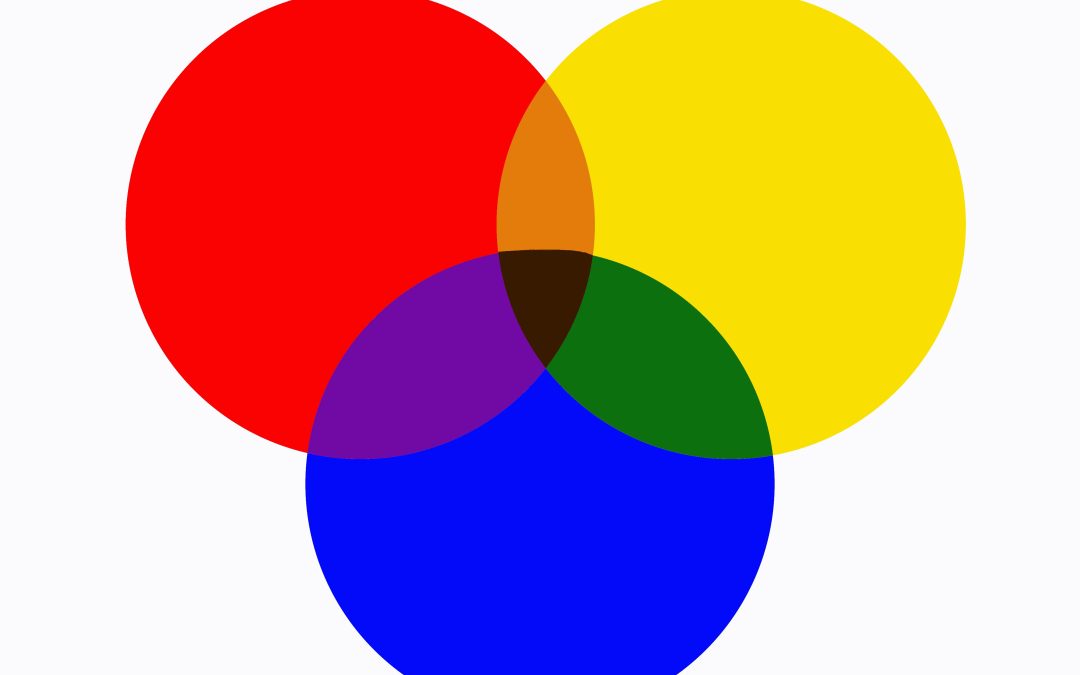
In marketing, you have precious few moments to capture the attention of your target audience or people will never give you a second glance. You could have the greatest product, but if you do not capture your audience’s attention in a short window, they won’t convert to a customer. One of the best ways of engaging your audience is a branding color scheme that pops and is complimentary to your product and message.
The best color palette for marketing is, at best, subjective to the audience and the product or services being marketed. You can, however, use some simple information to propel your color palette in a direction that benefits your company.
You can use some simple information to propel your color palette in a direction that benefits your company.
Why Color Matters in Marketing
An appropriate color scheme can convey excitement, authority, trust, passion, and even hunger or thirst. Imagine trying to sell a hot rod using earth tones or delicious food with unappetizing shades of gra. It likely wouldn’t work well. This is why the best marketing color palette doesn’t exist in a vacuum. Rather, it’s wholly dependent on what you are selling and to whom you are marketing.
Color psychology in marketing is a massive industry that helps define entire swaths of the advertising industry. People react differently to different colors. There’s a reason we associate red with passion and anger, green with nature, and blue and white with calm. Marketers spent an incalculable amount of hours over the last 100 years on perfecting color palettes in marketing. They’ve never been more important than they are now with social media and online marketing. With an extremely short amount of time to engage your audience, the correct colors can do a lot of the work for you.
Color Schemes for Every Occasion
Here are a few of the most prominent color palettes used in marketing and how they are utilized:
Bold reds and whites
Red is all about passion and energy. Red is provocative, attention-grabbing, and associated with power, urgency and excitement. If you want to sell the sports car from about earlier, red is certainly a useful color in that pursuit. White is neutral, clean and authoritative, and when it’s paired with red, it stuns and grabs attention. This pairing is extremely useful for calls to action or to create urgency about short-duration sales or click-away deals to capture your audience’s attention.Calming blue and orange
Blue is a calming color, and it’s associated highly with trust, security and reliability. Utilized highly in finance, tech and healthcare, shades of blue are useful in creating a sense of authority and trustworthiness in whatever sector you are dealing in. Orange is another high-energy, exciting color, and is appealing to younger audiences in particular. It is worth noting, however, that too much orange can be distracting. When you pair orange and blue, it creates a flare of innovation within your marketing, you would still want to use blue as the dominant color to cement that serious, authoritative brand identity. Let flares of orange say “Our brand is for all demographics.”Nature-inspired greens and browns
It doesn’t take a color psychology marketing guru to understand that green is intrinsically related to nature. You can see greens of various shades all over eco-friendly products, organic foods, and wholesomeness. Brown is a good anchor color because it is stable, calming, warm and trustworthy. The green and brown color scheme is absolutely perfect for any of the above-mentioned types of companies, along with sustainable products.Luxurious black and gold
Gold is a color that is used sparingly in most marketing because it is almost always associated with high-end, luxury and exclusivity. Black can be multiple concepts, but it is typically used to exemplify sleekness, sophistication, elegance and modernity. By itself, black is a powerful tool for minimalist design. When paired with gold, black transforms into a symbol of opulence. This color combination is great for expensive, rare and exclusive brands to create a sense of “in-crowd” within its customer base.Vibrant yellow and purple
There is little doubt that most people identify yellow as a color of energy and vibrancy, often used as an attention-grabbing element. Purple, on the other hand, is associated with luxury, creativity, opulence and drama. Like blue and orange, yellow and purple make a good pairing for targeting a younger audience or creatives. Yellow draws the attention of the audience, while purple adds sophistication and depth to media, ultimately conveying a sense of youthful wisdom and creative energy.
Color Palette Strategy Is a Marketing Game Changer for Businesses
Color palette strategy is deeply rooted in decades of marketing success and color psychology theory. It works because we have a long history of understanding how color evokes mood and behavior in human beings. Using it to your advantage in your marketing is a huge step forward. This is particularly important in an online space where you have competition from across the world. The right color palette can help you stand out positively.
If you would like to explore more about successfully marketing your business, Yankee Custom Marketing has the perfect team to guide you forward. Whether you’re looking for content and branding, guidance, social media marketing, graphic design or color palette strategy, we have the expertise to get the job done.
If you’re interested in attracting a wider audience and then converting sales, contact Yankee Custom Marketing today and see the difference that expert guidance can make in your business journey.

